
Cirqle
Qreating Quality Queer Qonnections
Imagine this: It’s a Saturday night and you finally settled into your apartment in a new city. After a month of moving, you want to host a cozy wine party to get to know others in the local queer community. But…. where do you even find them?
For many members of the queer community, it is difficult to create meaningful connections with fellow queer individuals without apps or nightlife. There is a scarcity of solutions dedicated to helping queer individuals build their local social circles.
The Cirqle app fills this gap.
Overview
Cirqle is a social networking platform that uses geolocation to connect queer individuals to their local queer community. This app was designed and created as my final project for the General Assembly User Experience Design course.
ROLE
End-to-end
UX Designer
DURATION
10 weeks
TOOLS
Hand sketching
Notability
Figma
Maze
TYPE
Mobile
My Role
Following the double diamond design methodology, I acted as the sole designer for all the researching planning, design, and testing processes.
These processes include conducting user research and interviews, sketching, visual design, wireframing, prototyping, and performing moderated and unmoderated usability tests.
Cirqle's Goal
The goal of this project was to design an application that promotes the sense of belonging by enabling queer individuals to find, take part in, and host queer-centric activities in their local neighborhood.
With creating this app, I wanted to:
-
Create a platform that is inclusive of the entire queer community.
-
Promote queer activities that don’t necessarily involve participating in nightlife or using dating apps, which is currently the most prevalent way of finding fellow queer people.
-
Support queer-owned businesses and identify queer spaces.
-
Help queer individuals feel less isolated and that they are truly part of a community.
The Research
Research Plan
Setting the stage
Before diving into the actual user interviews with the community, I wanted to create a research plan that helped identify the most pressing needs in the queer community regarding connecting to fellow queer individuals.
My research goals were to understand:
-
What methods are used to connect with other queer individuals?
-
Are these methods aligned with the nature of the connection that they are trying to establish?
-
What are the key issues that the community faces given the current available methods?
-
How do queer individuals connect with local queer-owned businesses?
User Interviews
Meet Cirqle's target audience
As a member of the queer community, I leveraged my network and conducted a dozen interviewers with other queer individuals. Since I wanted Cirqle to be representative of the entire community, I made sure that the interviewees spanned a wide range of demographics including sexual orientation, gender identity, age, race, and religion.
These interviews helped create a holistic view of the community’s current challenges and specific needs when it comes to building queer social circles.
Some of the user profiles that took part throughout the UX study.
User Interview
Main Takeaways
The driving force behind Cirqle
1. They want a platform for non-romantic relationships.
All interviewees expressed their desire for a way to meet local queer people and create meaningful, platonic connections without having to resort to dating apps.
2. They don’t necessarily want to meet people in clubs and bars.
Some interviewees are not particularly of nightlife or crowded spaces and prefer to have more intimate activities in a smaller group setting.
3. They love the idea of supporting queer spaces.
Most of the interviewees wanted to have a mechanism to find queer-owned businesses or businesses that host queer events that they can attend.
4. They want to feel that their meetups are safe.
All interviewees discussed how safety is a primary concern when meeting strangers off the internet. Being able to verify that someone is who they say they are is important.
User Personas
The archetypical users
Style Guide
Breathing life into Cirqle

After identifying the key takeaways from the user interviews, I wanted to create two personas that would be the ideal users of Cirqle. Jessie Love, the activity seeker, and Marlie Cross, the eager host.


Problem Statement
Queer individuals need a social networking platform to find, participate in, or host activities with other members of the community because they want to effectively connect and build non-romantic relationships.
Competitive
Analysis
How do we disrupt the market?
One major issue with creating a new social networking platform is the fact that the industry is already saturated with a variety of different applications that help connect strangers.
To get a better understanding of the value add that Cirqle would bring, I identified applications that fell into one of two groups: either the application’s primary demographic was queer individuals or the application’s primary purpose was to allow people connect in a non-romantic way.
This process revealed that applications exist for the queer community and also for hosting/attending events, but not for both.
Competitor: Grindr

Competitor: Eventbrite

Competitor: Facebook

Pros: Grindr does a fantastic job at showing local gay men in the area - often times these profiles have detailed information and social media links attached to them.
Cons: Not only is the app not inclusive of all sexual orientations and gender identities, but the major downside is that this app does not promote purely platonic relationships.

Pros: Eventbrite’s platform is great for hosting and attending local activities. It even allow users to follow organizers they like, making it easier for the user to frequent the same user’s events.
Cons: The concept of the app does not foster building relationships of any kind. It is simply an application just for posting activities.
Pros: The concept of the app does not foster building relationships of any kind. It is simply an application just for posting activities.
Cons: Although there are groups that foster queer communities, they are not solely for local queer circles since there is no location info.
Feature Prioritization
Building the MVP
Two things became clear from the user research: queer folks wanted a platform that fostered non-romantic relationships with other queer folks and they wanted a platform that helps them connect with local queer-owned or queer-supporting businesses.
With the user’s two major features in mind, I gathered all the highlighted features that came from the user interviews and placed them on a 2x2 matrix to show where these tasks would fall on design effort and impact.
Roadmap
The path forward
Given all the potential features identified during the prioritization process, I decided to create a realistic roadmap for Cirqle and highlighted which features would be in the first iteration and which would be rolled out in later versions.
I also discovered a few features that might be beneficial to add to Cirqle, but would need more research to see how it could be integrated into the rest of the platform.
User Flows
Defining the user's process
With the two main personas pinpointed and the major functionalities chosen for the first iteration of Cirqle, I wanted to flesh out the two primary functions of the app: finding/signing up for an activity and hosting an activity.
Flow #1 - Finding/signing up for an activity
Not only do users have different information about an activity they’re searching for, but the process of signing up for an activity will slightly differ depending on the type of activity.
Flow #2 - Hosting an activity
As a host, being able to effortlessly post your activity to the community is essential. The quicker the activity is hosted, the quicker the host can start connecting with users!


The Design Process
Low-Fidelity
Wireframes
Having created the user flows for the two key features, I wanted to create a tangible representation of what Cirqle would look like. After many pen and paper sketches, I translated some of the visual design to a low-fidelity prototype.
This low-fidelity prototype would serve as the starting point and basis for my first usability test. I wanted to gather some quick feedback and iterate on the design to make it more user-friendly.

Low-Fidelity
Usability Test
The first iteration of Cirqle was ready to go and I went back to my target audience to get their first impressions.
During the moderated usability test, I walked the participants (5) through a series of different actions that a user would take when using the app. Following each activity, I gathered some feedback around three characteristics: the ease of use, the effectiveness of the user interface for the action, and the satisfaction of the user interface.
The Good
1. Homepage
All participants were satisfied with the design of the homepage. They liked the idea of having different sections for activities, which made browsing for activities a little bit more exciting.
2. Activity host & attendees
All participants enjoyed being able to see the host of the activity and the attendees that had already signed up. Most felt that knowing who would be at an activity would play a part in whether or not they wanted to sign up.
3. Queer space page
4 out of 5 were extremely satisfied with the Queer Space page. They were particularly fond having the option to visit the space’s website as well as see upcoming events.
The Bad
The Bad
1. X miles away on search page
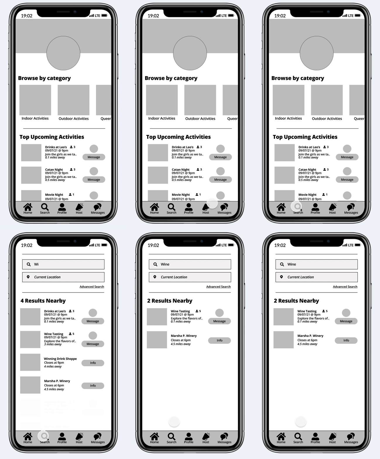
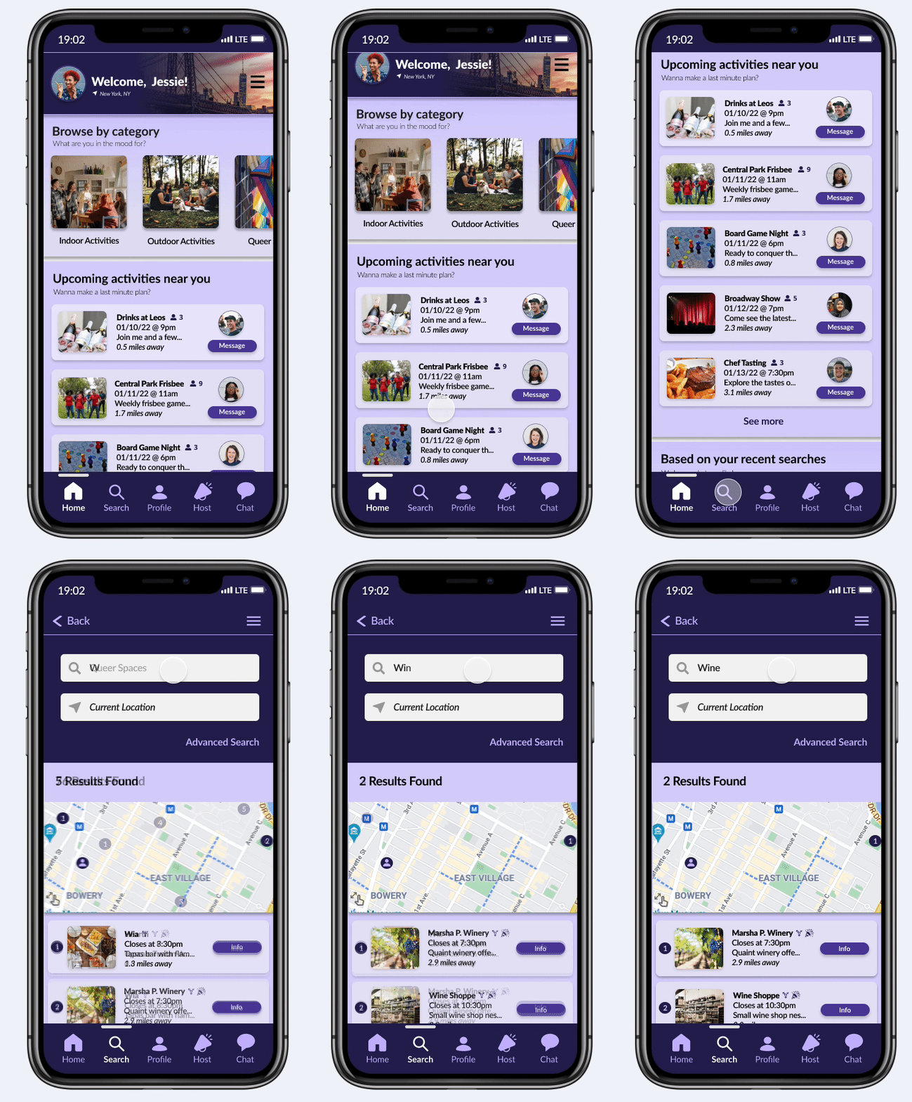
Having the option to search for activities and queer spaces around your current location was great; however, the information about the activity/space being x miles aways from the user was not helpful to the participants. They wanted to have a better sense of what x miles meant in relation to their current location.
2. Location & hours for queer spaces
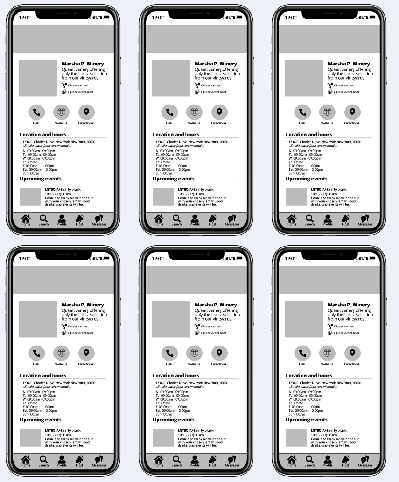
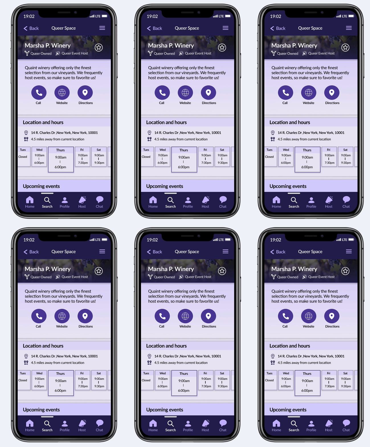
All participants did not like the copy that was used for the location and hours information. The spacing, hierarchy, and size was “jarring” and “distracting”.
The Ugly
1. Activity cards
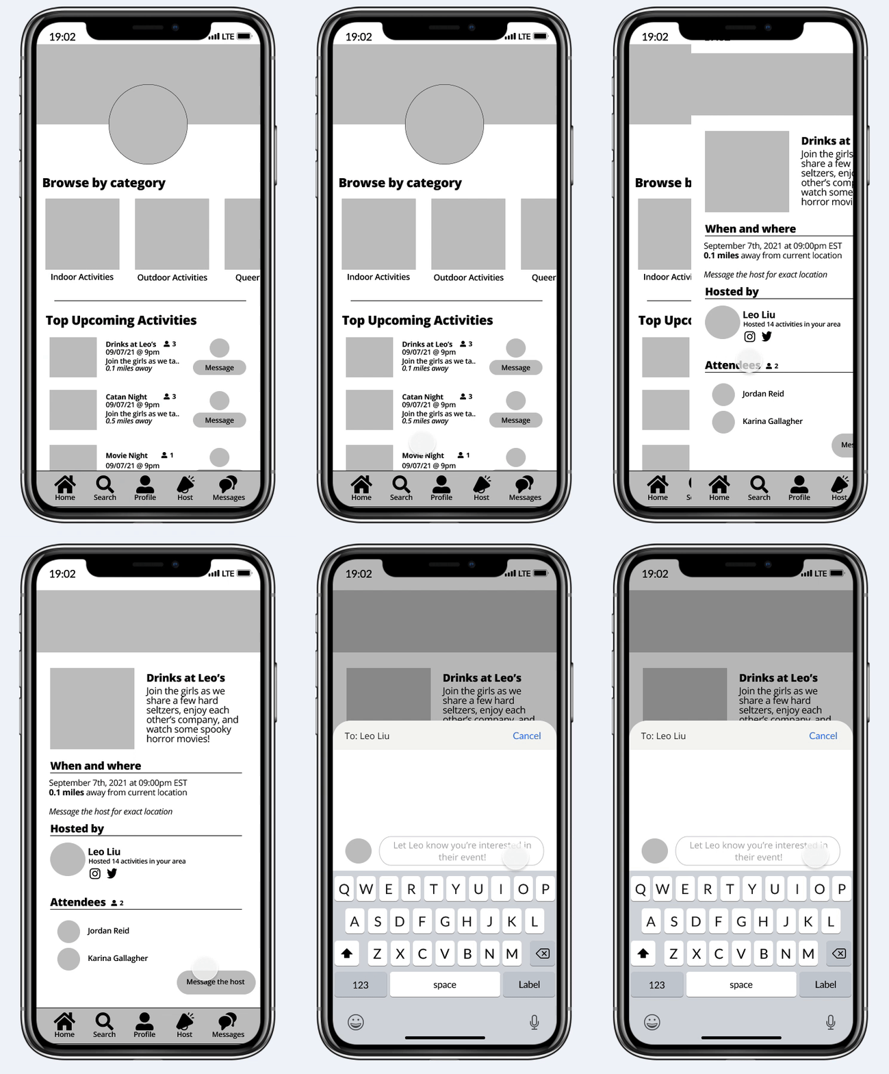
4 out of 5 participants commented on how the activity cards on the homepage and search screen were a bit misleading in the sense that they did not know where to click to view the actual activity.
2. Message the host button
All participants expressed dissatisfaction with where the “message host” button was located on the activity page. They described it as “difficult to find” and “hidden among the information”.
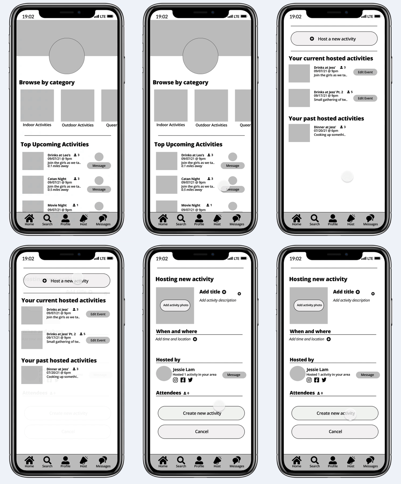
3. Hosting an activity
4 of the participants were overwhelmed with the amount of information that was on the one screen. They felt that it would be difficult to find where to edit a specific section of the activity if they wanted to change something.
Style Guide
Breathing life into Cirqle
Before addressing all the concerns that surfaced during the usability test, I wanted to make sure that Cirqle had a solid brand and identity. I chose the color purple to represent this application because purple has been a longstanding color and is identifiable as one of the inclusive colors of the queer community.

High-Fidelity Prototype
With every design comes many iterations. To give a better sense of how I applied the feedback from the users and how the design changed over time, I wanted to show a side-by-side comparison of the low-fidelity prototype and high-fidelity prototype and address all the concerns in the bad and ugly category.
Fixing the Bad: Miles on search results
Low-fidelity
High-fidelity
Fixing the Bad: Queer Space logistics
Low-fidelity
High-fidelity
Beautifying the Ugly: Activity cards
Low-fidelity

High-fidelity
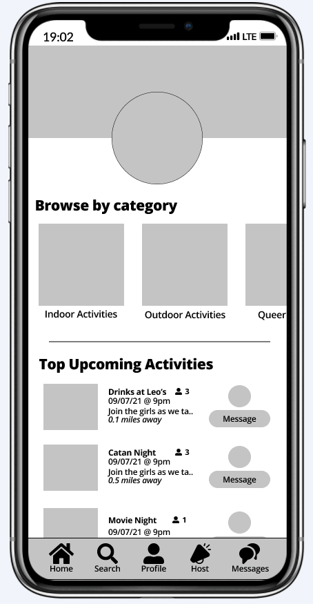
Beautifying the Ugly: Signing up for an activity
Low-fidelity
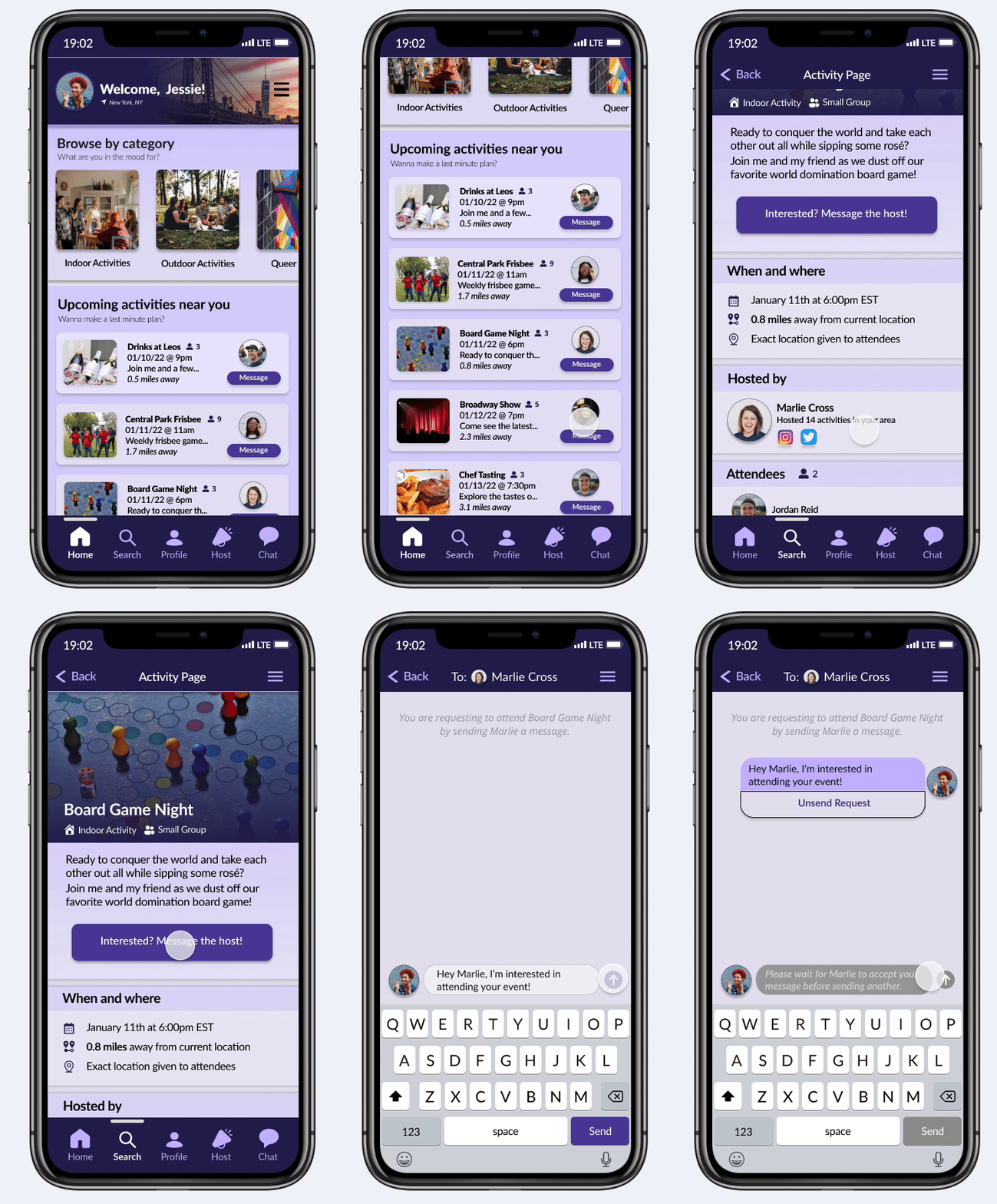
High-fidelity
Beautifying the Ugly: Hosting an activity
Low-fidelity

High-fidelity
High-Fidelity Prototype Usability Test
16 participants took part in the unmoderated usability test which had them complete three separate tasks: host an activity, join a user-hosted activity, join a business-hosted activity.

15 participants said that they would use Cirqle to connect with their local queer community.
"This was so straightforward and intuitive"
- Participant #3
"I found this app to be very easy to navigate"
- Participant #7
"Super easy and self-explanatory! LOVE IT!"
- Participant #14
Just the beginning for Cirqle!
What I learned
Being a part of the General Assembly UX Design certification course not only helped build upon the knowledge I already had of the field, but it taught me valuable lessons that I will take with me as I move into my career as a designer.
1. You will iterate.. many times. Out of all projects that I worked on in the past, Cirqle was by far the most fun and challenging because of the iterative process I took. There were many times where I'd take a core functionality, like signing up for an activity, and mock up 3 to 4 different flows with different visual styles to see which one would be the most effective.
2. Unmoderated usability tests are your friend! This was my first time performing an unmoderated usability test using Maze and I have to say - it was fantastic! The amount of genuine feedback I received was amazing and it was great to see different approaches to testing your product!
Next Steps
As the header of this section states: this is only the beginning for Cirqle. There was a tremendous amount of positive feedback from members of the queer community and many people asked "when can we actually use this?!". Although full development of this app isn't going to happen in the very near future, there are a few next steps I would like to take to get there.
1. A/B testing of different screens. Throughout the process I accumulated a variety of different flows and visuals that were going to be used for the final high-fidelity prototype; but, due to time I was unable to test them all.
2. Create a full onboarding experience. Once thing about this app was that it assumed users already had an account. But what about all our new friends who want to join Cirqle? They need a thought out onboarding experience that'll show them the lay of the land!
3. Queer Resources page. One tab that made it onto the high-fidelity prototype, but did not have a full design to go with the feature was the queer resources page. During the unmoderated usability test, many users expressed their interested for this feature making it one of the first to-dos in the backlog!