
Trace
Northeastern University COVID-19 App
October 2020 - 6 months after the global COVID-19 pandemic reached the United States. Northeastern University students are beginning to adapt to this new normal of attending classes on a hybrid basis. With this transition in instruction comes a new set of guidelines - frequent testing, daily wellness checks, and of course, mask wearing.
Northeastern reacted to the pandemic by creating a variety of different websites to perform the slew of tasks needed to attend in-person classes. Although the speed at which they churned out these websites was second to none, the user’s experience left a lot to be desired.
Trace was created for students on-the-go and acts as a one-stop-shop for all the COVID-19 related activities at Northeastern University.
Overview
Over the course of 8 weeks, my project team and I collaborated to complete the full UX design cycle and designed a mobile application that would replace Northeastern’s myriad of websites on COVID-19 information and services.
This app was designed and created as my final project for my human-computer interaction course during the Fall 2020 semester.
ROLE
End-to-end
UX Designer
DURATION
8 weeks
TOOLS
Hand sketching
Balsmiq
Axure RP
Figma
TEAM
Soumeng C. | UX Designer
Lisa L. | UX Designer
Shebna M. | UX Designer
My Role
With four designers working on this, we each played a part in the entire ux process including gathering the generative & evaluative research, wireframing, and prototyping.
In addition to the above mentioned processes, the biggest contribution that I made to the project was that I was the sole designer for the high-fidelity prototype.
Design Challenge
Our challenge was to redesign the user experience when interacting with Northeastern University’s COVID-19 resources and websites.
The goal of this application is to create an on-the-go platform that includes, but was not limited to, all of the features that Northeastern University created to combat the virus, such as scheduling COVID-19 tests, viewing results, and daily wellness checks.
The Research
Research Plan
Laying out the foundation
To efficiently gather data, the team decided to split into two groups where one group would focus on evaluative research based on the already implemented websites and the other group would perform generative research to see what students would want from a one-stop-shop application.
I led the evaluative research group that aimed at understanding three key metrics for Northeastern’s current websites pertaining to COVID-19 information and services:
Efficiency: e.g. How long did it take users to find and complete all mandated activities?
Effectiveness: e.g. How likely were users to omit some of the guidelines because of difficulty in using the services?
Satisfaction: e.g. How would users describe the overall experience and mental effort of using the services?
Once the evaluative research was performed, the generative research group wanted to gain insight and focus on the following questions:
What type of notifications do users like to receive regarding COVID-19 guidelines?
What functionalities do users want to be highlighted in a COVID-19 service application?
How connected would the users want the functions of this app be with other campus services such as medical aid or mental support?
User Interviews
Gathering the data
Our target demographic was Northeastern University students who were either on campus full-time or participated in a hybrid structure. Both research groups interviewed the same 6 individuals coming from different majors and years of study.


User Interview
Main Takeaways
Digesting the data
1. The current system for completing mandatory COVID-19 activities was cumbersome and time-consuming.
4 out of of the participants stated that the websites that Northeastern created were difficult to find and navigate.
2. They didn’t mind completing the mandatory tasks, but don’t want an application that was overloaded with information.
The users already felt overwhelmed with the amount of tasks that needed to be completed to be on campus, so they wanted an application that solely focused on the priority tasks.
3. They wanted a centralized way to view all notifications.
Instead of having to check multiple sources, all participants expressed a desire to have a single source for notifications.
User Persona
Synthesizing the takeaways
Our main user persona is a fictional representation of the entire user group that took part in our user research. The participant's commonalities were combined to create Ruby Rails, a graduate student at Northeastern University starting her program during the onset of the pandemic.

Problem Statement
Northeastern University students need a centralized platform for COVID-19 related information and services pertaining to campus life because they want an easy way to complete mandatory COVID-19 procedures and monitor their wellness.
Affinity Diagram
Categorizing the data
Once the the user interviews concluded and both research groups compiled the notes, we wanted to group our notes to understand what were the biggest factors affecting the current systems and see if there were:
-
Any emerging trends in the three major factors of efficiency, effectiveness, and satisfaction from the evaluative research?
-
Any common wants or needs identified from the generative research?

Feature Prioritization
Distilling the features
Before jumping into the low and medium fidelity for Trace, we wanted to have a solid path forward with the functionalities that would be included.
To make this application adhere to the university’s standard, we understood that there were certain features that were a must-have. There were, however, some features that came up during the user interviews that we wanted to consider before we finalized the minimal viable product.

The Path to Redesign
Low & Medium Fidelity Prototype
With the key features identified for the minimum viable product, the team quickly created low fidelity wireframes with Balsmiq and transformed it into a medium fidelity prototype using Axure RP to test it with the users.
During the usability test of the medium fidelity prototype, there were several fundamental issues that manifested themselves. The sections below highlight the key features and the qualitative feedback that the team received from the participants.
The Convoluted Homepage

-
The users were less than thrilled with how much information was being displayed on the user homepage.
-
The appointment overview was helpful, but the users would rather have a more unified dashboard for all notifications regarding the app.
-
Clicking the link to access the homepage was not entirely mobile-friendly and was reminiscent of the webpages.
-
The exposure alert was too small to see and had too much information packed into the small space.
The Lukewarm Test Results
-
Users appreciated being able to see the list of all of their past testings and results.
-
The users questioned the need to have a sending mechanism for test results if the application was going to have to send notifications as well.
-
Receiving feedback after performing made interacting with the application easier.

The Confusing Appointments

-
The users strongly disliked the fact that scheduling, changing, and cancel appointment all used the same user interface.
-
The input for the testing location was ambiguous and difficult to identify.
The Entrapping Daily
Wellness Check

The major feedback the team received from the DWC is the fact that there was no option to go back and forth through the questions once a question was completed. This meant that there was no way for the user to correct any errors that they may have made.
High-Fidelity Prototype
The feedback from our users was alarming with the deadline for our prototype approaching. While my team members focused on gathering more data points from other users, I incorporated the feedback from the six participants that we already had into a high-fidelity prototype using Figma.
Not only did I address the process changes suggested by the feedback, but I also gave the user interface a visual refresh and a new identity by incorporating branding, consistent typography, and a redefined color palette. Both the typography as well as the color scheme come directly from Northeastern's established branding.

Login & Homepage
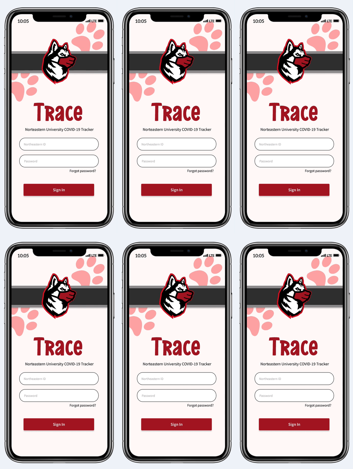
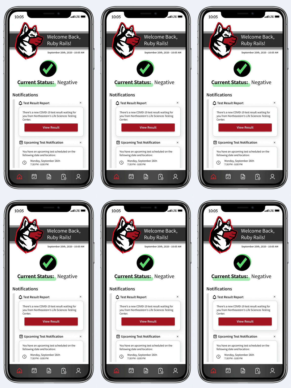
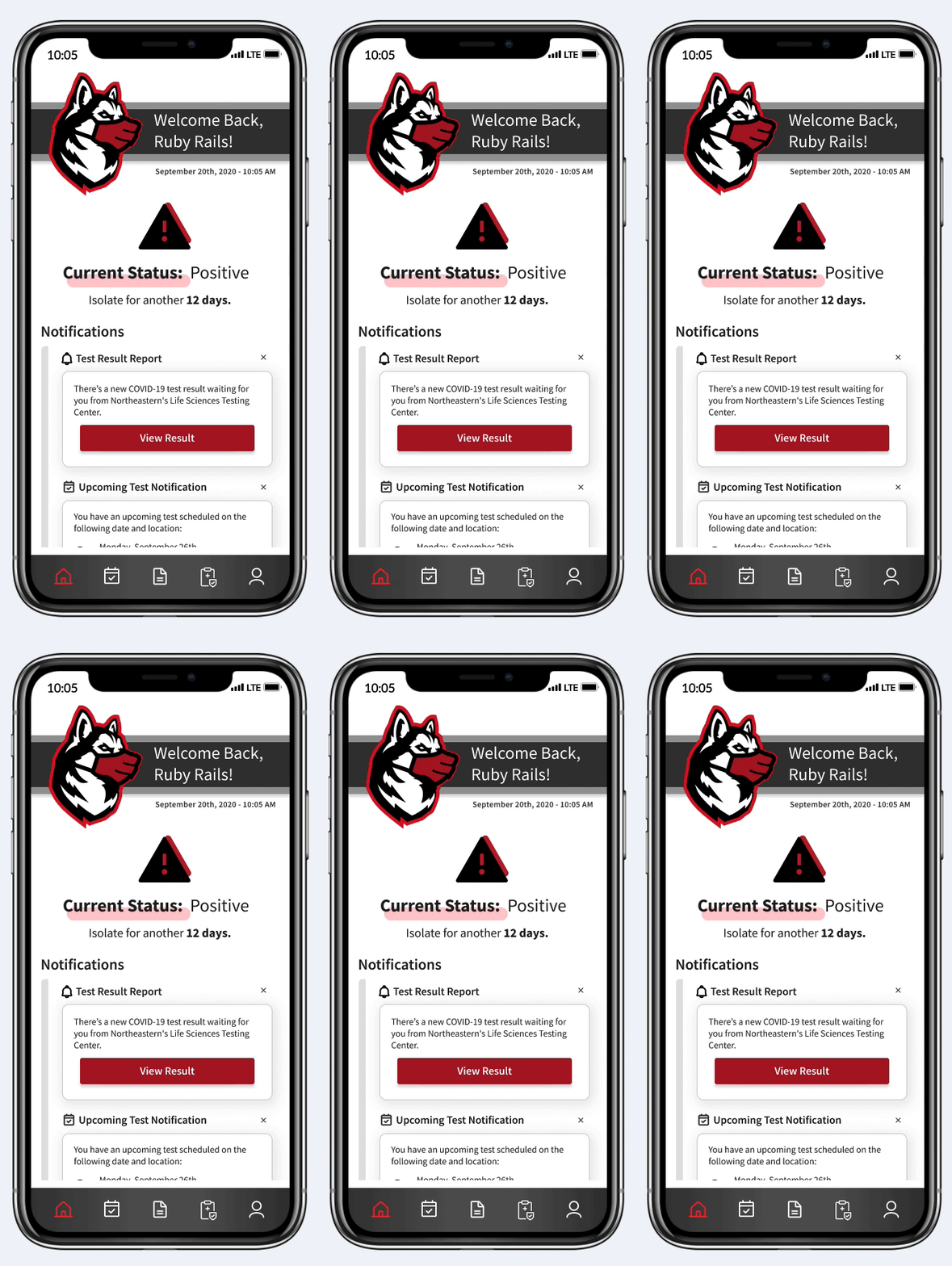
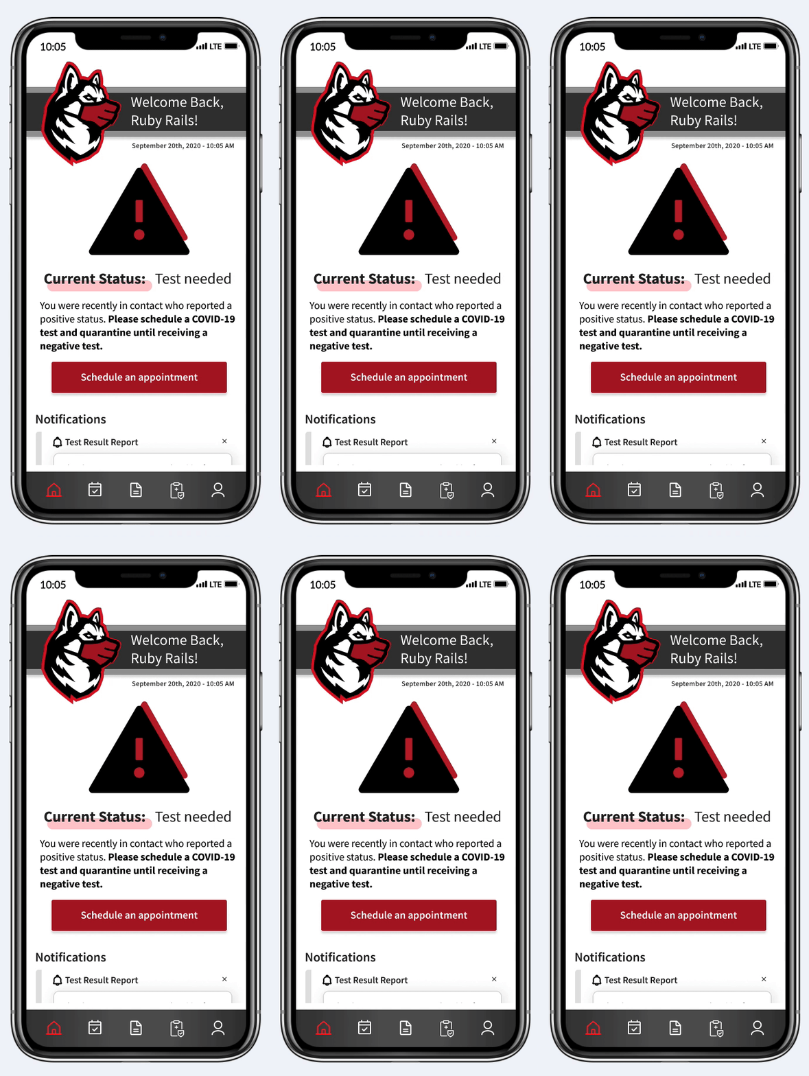
When logging onto Trace, Ruby will see one of three homepage screens depending on her COVID-19 status. Each page has a unified notification hub so that regardless of her status, she can keep up with her appointments and test results.
Schedule Appointment
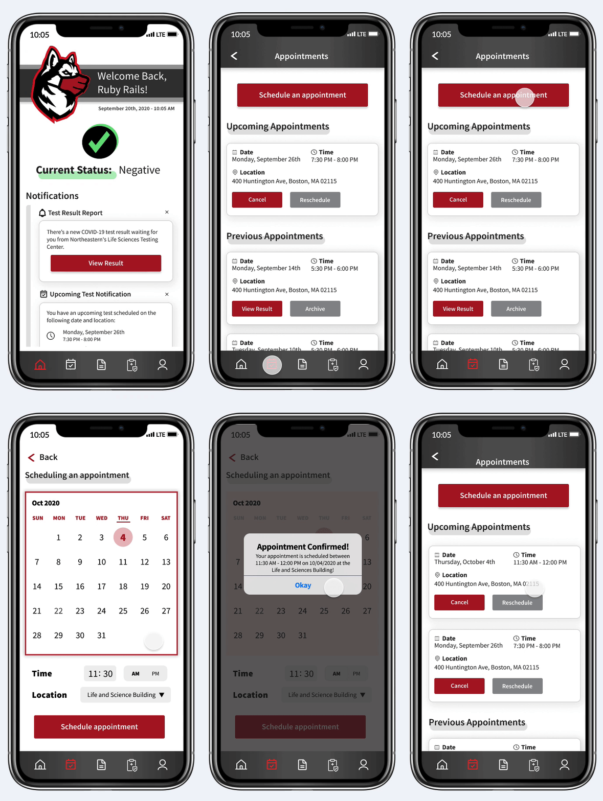
Ruby needs to schedule her last minute appointment without having to go through a bunch of hurdles to do so. The appointment process is a simple three-step process that allows her to easily take care of this menial task!
Viewing Results & Notifying Others
Oh no! It looks like Ruby received a positive test results. She wants to make sure those around her are safe so she decides to send an anonymous notification to those that she may have been in contact with.


Daily Wellness Check
It has been one month since Ruby recovered from covid and she has decided to go back to campus for classes. It's her first day back, but she must do the hassle free daily wellness check before heading to class.
Results and What I Learned
After the redesign and with a week left in the deadline, the team and I were able to get our participants to partake in a final usability test of the high-fidelity prototype that I created.
Comparing with before the redesign, the application showed increased:
Efficiency - users took less time to complete tasks such as finding a test a result or scheduling a new test.
Effectiveness - there was a 100% completion rate of tasks by the users in comparison to the 80% completion rate that was gathered during the usability test of the medium-fidelity prototype.
Satisfaction - users reported significantly less mental effort to complete tasks and appreciated the visual refresh.
What I Learned &
Next Steps
Do not cut corners: Because the team had a tight deadline, the low and medium-fidelity felt rushed. It did not have the visual appeal that we had initially anticipated and violated several fundamental UX principles that showed up during our medium-fidelity usability test. There is always going to be a time component to your work, so it is critical identify and execute the top priority user requirements.
Test early and more often: Not having fully tested our low-fidelity prototype before creating the medium-fidelity prototype became a major setback. Had we put more emphasis on identifying the user experiences issues earlier on, we would have said a significant amount of effort in redesigning closer to the deadline.
Communication is paramount: It is always helpful to align the team thoroughly on all aspects of the design process including research, visual style, and prototyping. The ideal design process involves different team members organically together and not in disjoint fashion.
The immediate next step identified in our application would be to do more thorough testing with a larger pool of candidates to see if there is anything else the team might have missed. Hopefully the end of the pandemic is on the horizon and that this app can be repurposed to a more general wellbeing application for Northeastern University students