
Top Dog
Ready to become this week's Top Dog?
Dog owners this one's for you! The days of dreading leaving your place to go a long walk with your pup are over. It's time to track your pup’s progress as they walk their way to Top Dog.
Get ready to set high goals for you and your pup, log your walks, and look at how far you and your pup have gone all while building your local pack by seeing how other pups are walking!
We hope you have your dog treat bag handy because it's time to give virtual treats to other pups to encourage them, and find companions (or rivals!) in your area to socialize your dog!
Overview
Top Dog is a holistic dog walking app that helps you meet your dog walking goals while they build their territory and pack. It helps you stay accountable for your dog-related duties while your pup walks their way to the top.
In this 10-week project, my team and I collaborated to complete the full UX design cycle while simultaneously producing an MVP android application written in Java.
This app was designed and created as my final project for my mobile application development course during the Summer 2021 semester.
ROLE
UX Designer
& Developer
DURATION
10 weeks
TOOLS
Hand sketching
Figma
Android Studio
Java
TEAM
Marta P. | UX Researcher & Developer
Emily C. | Lead Developer
Alanna P. | Developer
Jared M. | Developer
My Role
During this project, I lead the UX design process which included conducting user research, sketching, prototyping, and testing.
Once the high-fidelity was created, I then shifted to the assisting in the coding development of the application by contributing to the frontend of the application.
The Research
Research Plan
Kicking off the project
Starting this project was really interesting for me because I am a self-proclaimed cat person and really had no insight in on what it was like to be a dog walker. Fortunately, my teammate who was also a part of the design process did own a dog, so it was great to come at this research plan from both perspectives.
Prior to jumping into the design aspect of this project, my teammate and I wanted to fully understand the features that would enhance the dog-walking experience for owners and dogs alike.
Our research goals were to understand:
-
What would stimulate users to walk their dogs more often?
-
What would create a more engaging dog-walking experience?
-
How do dog owners keep track of how many walks and how far these walks are with their dog?
-
How do owners connect with each other to help their dog socialize with other dogs?
User Interviews
Discovering the breed
Due to the limited time and resources, my teammate and I conducted a smaller scale study with four participants. We still strived to maintain diversity among the participants, the only constrain being that they are dog owners and that they walk their dogs themselves.
Although diverse in other aspects, we acknowledged that our participants shared the commonality of living in an apartment in a major city, were all students or working full-time, and only owned one dog.
We knew that this user pool was not representative of the entire dog-owning community, thus we wanted to scope our project to target young adults living in major cities with one dog.
User Interview
Main Takeaways
What makes the user's tail wag
1. They like to socialize and compete.
The participants feel like adding a competitive or social element to walking their dog would motivate them to walk more.
2. They don’t like being distracted during their walks.
If they are completing an activity while walking their dogs, they would like it to happen naturally without having to be distracted by their phone.
3. They love systematic visualizations of their walk history.
With records of their walks, the interviewees felt that would keep better track of how much exercise they and their dog received and can adjust their walk schedules accordingly.
User Persona
Our pedigree user
Meeting with our participants helped give us a better sense of who we were designing Top Dog. To make sure we were reaching our target audience, we chose to create Marta and her pup, Toby.

Problem Statement
Dog owners need an application that not only incentivizes them to walk their dog, but also helps them keep track of their dogs walking patterns because they want to ensure they are providing the right amount care for their dog.
Competitive Analysis
Standing out from the pack
Creating an application that assists the dog owner when walking their dog is not a groundbreaking idea. My teammate and I were able to identify several direct competitors that already had features like tracking the walk and socializing with other dog owners.
So how exactly would Top Dog disrupt the market of apps that are currently out there? Top Dog will add gamification to the dog walking process by introducing a local leaderboard that is correlated to the amount of walks you take in a given week.
It will be the only application that both promotes interactions with other dog owners in the app and uses gamification to incentivize dog walking.

Feature Prioritization
The MVP's major tricks
Although we had a small user research pool, there were a vast amount of features that were identified. Since we needed to start developing the framework for the coded application while simultaneously finishing the design process, we wanted to prioritize the features so that the MVP could be delivered on time.
Decisions made during this process were affected by two key factors: the feasibility of implementing the feature before the deadline and the value add that the feature would bring to the core concept, which is incentivizing dog walking.

The Design Process
Rapid Visual
Ideation
Time was certainly not our friend during this project and the team needed to start coding the visual foundation for our application.
Before kicking off this process, my teammate and I wanted to get some visuals in front of our participants to see if we can get insight on how we could make this app better.
We produced a mixture of hand sketched and low-fidelity mockups of some of the core screens that we put in front of the users.
Login
Leaderboard
Onboarding
Homepage
Log walk

Ideation Takeaways
The quick usability test of our low-fidelity prototype proved to be extremely helpful in understanding what did and didn't work about our design.
-
The leaderboard didn’t seem very much like a leaderboard seeing as there was no definitive ranking for the dogs. It also did not highlight the “top dogs” in the area in comparison to the rest of the dogs.
-
The onboarding experience seemed too dense and didn’t give the users a baseline understanding of what the application was.
-
The users appreciated the minimalist approach to the homepage and the actual tracking mechanism.
Redefining the Onboarding Experience
Prior to creating a high-fidelity prototype for our application, I wanted to address one of the key concerns from the ideation phase: new user experience.
To get a better understanding of how a new user would interact with our application, I wanted to walk through each step that the user would see and highlight the purpose of the steps.

Style Guide
Best in show visuals
With the onboarding experience fleshed out, I moved into designing the high-fidelity prototype that served as the basis for development. We didn’t put much thought into typography and color palette during the ideation phase of our project, so before prototyping I wanted to make sure the whole app was aligned with a style guide.

High-Fidelity Prototype
Homepage and Sign In
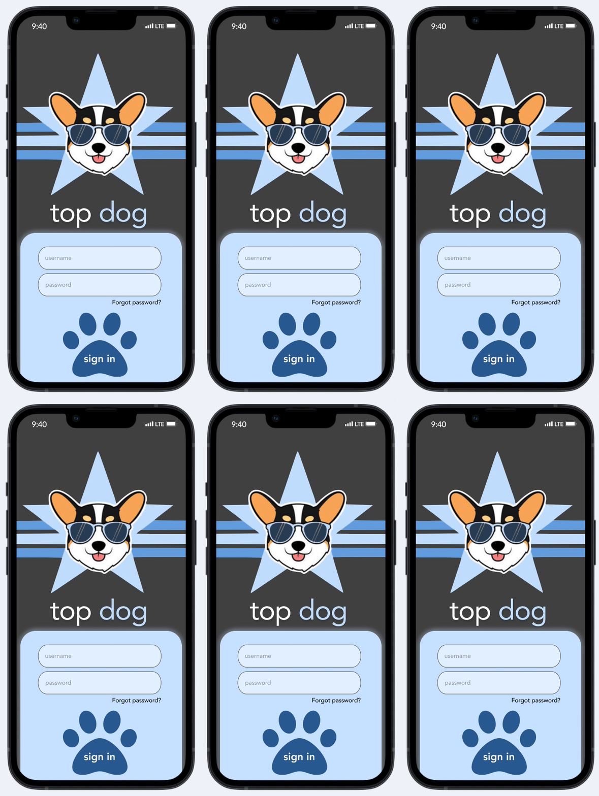
As a returning user, Marta would have a straightforward process to sign in by simply being prompted to enter in a username and password.

Onboarding
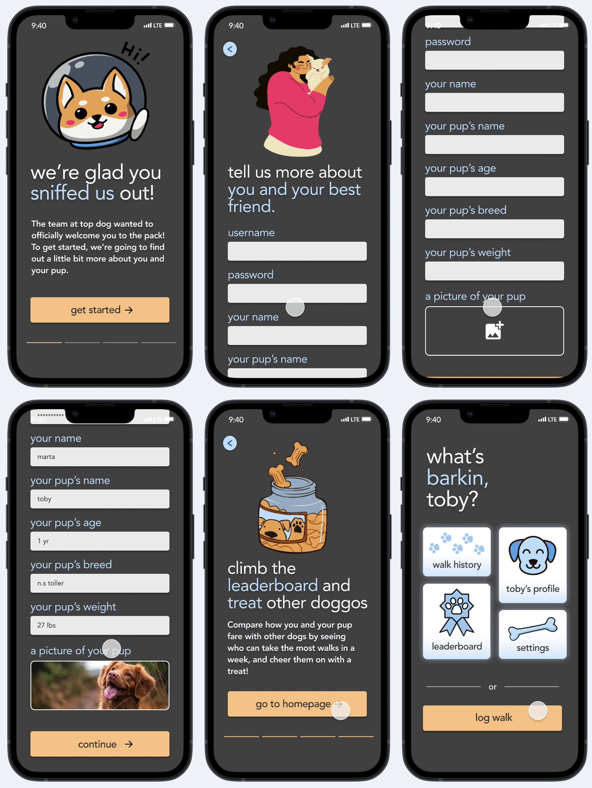
Now if Marta wasn't a returning user, I wanted to help her get started by following the flow above. This onboarding experience will not only get her started with the basics, but will also give her a glimpse at what the core functionalities of the app are.
Log Walk
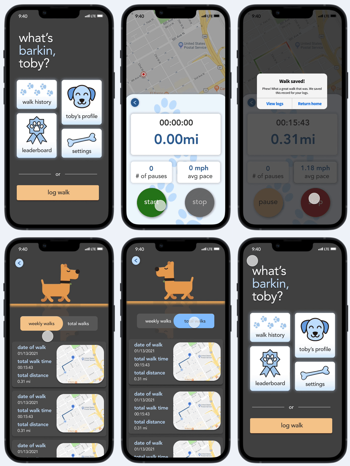
Since Marta is so busy, I wanted to ensure that the core functionality of logging the walk was simple. Therefore, all Marta has to do is tap the log walk button and she'll be brought to walk screen. If Marta has had exposure to any type of timer application in the past, using the log walk functionality will be a breeze because it creates a strong mental model of already timer applications.
Leaderboard
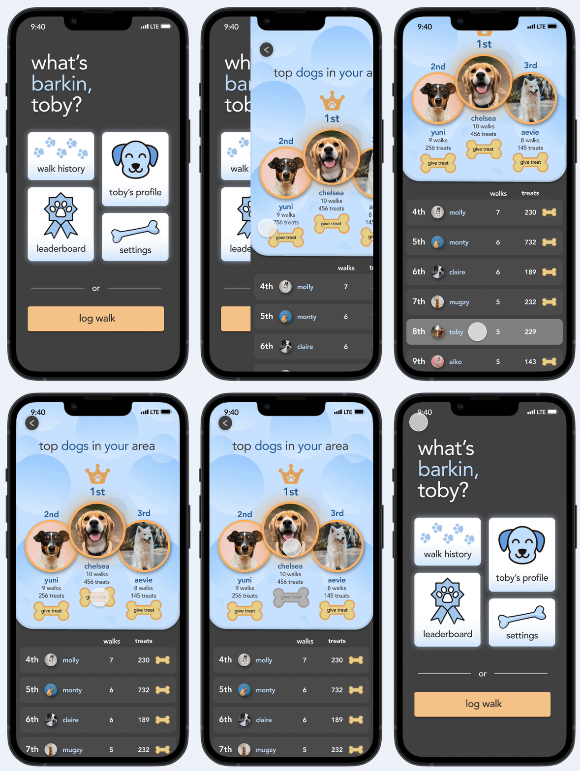
Whew! Marta and Toby had a great walk. She now wants to see how Toby is doing on the leaderboard. She scrolls down and sees that she's in 8th place, but that's fine because their best pup Chelsea is leading the pack! To reward her good effort, Marta sends Chelsea and her owner a virtual treat.
Settings & Profile
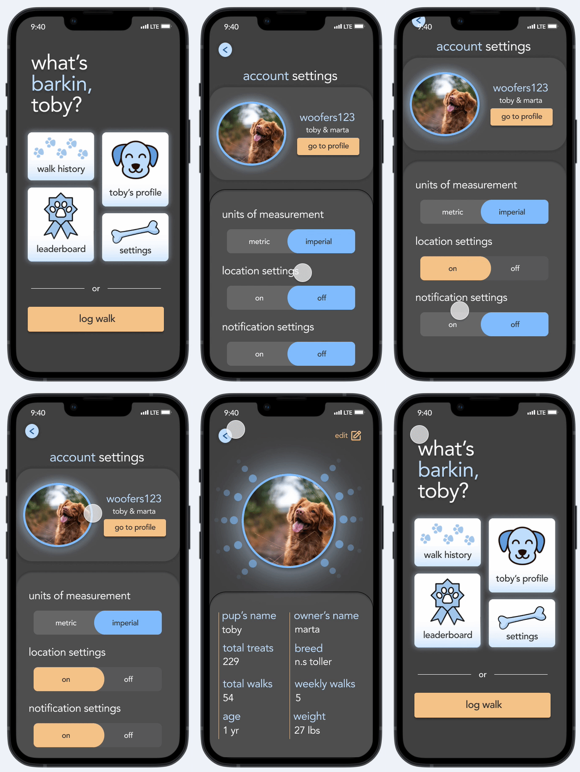
Before Marta heads off the app, she wants to check that all of her settings are correct. After tapping the settings button on the homepage, she sees that all of her settings were wrong! She corrects them and then heads to Toby's profile page to make sure everything there looks correctly and fortunately it does! Despite the sore legs, Marta smiles, shuts off the app, and feels proud that she was able to give Toby the walk he deserved.
Results and What I Learned
While I completed the design, the rest of the team was chipping away at the backlog of tasks for the actual coded prototype. Unfortunately, once I finished mocking up the high-fidelity prototype, I needed to switch hats and dive into coding the application with the rest of the team. This meant that the final usability test of the prototype needed to be put on the back burner... for now!
After a long 10 weeks, we were able to churn out a minimal viable product that included the core functionalities. Following the submission of the application to our professor, I thought about the process in retrospect and what I learned.
1. The more user participants, the better: Even though we were able to gather great data from the small user pool that we had, I feel as though the discovery process would have been more fruitful had we had just a few more users participating in the design process.
2. Know the technical limitations: The high-fidelity prototype I designed proved to be a much more challenging task to actually implement into code due to all of the little nuisances in the design. Although we were able to code the core functionalities and the base frontend for the application, we simply did not have the time nor the resources to fully code the high-fidelity prototype in its final statement.
3. The designers and developers need constant communication: Despite wearing both the hat of a designer and developer, it was crucial for the developers who were not directly a part of the design process to be in-the-know of updates in the design. Our team communicated these changes well, which made it a much more easier to make quick changes to the code to reflect the design.
Next Steps
The immediate next step would be do an actual usability test of the final high-fidelity prototype. Doing this would allow me to identify any fundamental issues that the design has and address them before continuing with the development of our product.
More specifically, I'd like to address the leaderboard feature and see if its current iteration provides enough user engagement and if not, what could we do to enhance it.